
About Me
- Patrick Jr
- My name's Patrick and I am an A Level student,taking on AS Media Studies for a year. I am enjoying the subject and through this I hope to gain more knowledge of what type of affect media has worldwide
Wednesday, 9 March 2011
Tuesday, 8 March 2011
Hip Hop Music Magazine - Powerpoint Development
 |
| Slide 1 - Music Magazines |
 |
| Slide 2 - Genre: Hip Hop |
 |
| Slide 3 - The Research |
 |
| Slide 4 - The Codes & Conventions: The Source |
 |
| Slide 5 - Fonts: VIBE, SCRATCH, THE SOURCE |
 |
| Slide 6 - Hip Hop Target Audience |
 |
| Slide 7 - Conclusion |
Displayed above is seven slides that explain: my genre, the codes and conventions of example magazines which were researched, the font which is regularly used in a hip hop music magazine ranging from a number of different colours, the target audience of this genre and reason behind them being attracted to hip hop magazines and a conclusion which explains: how my research will help with my magazine, my primary target audience and an brief overall explanation of how I will have to apply research and planning to my own music magazine overcoming the challenges that lie ahead.
Music Magazine - Photography


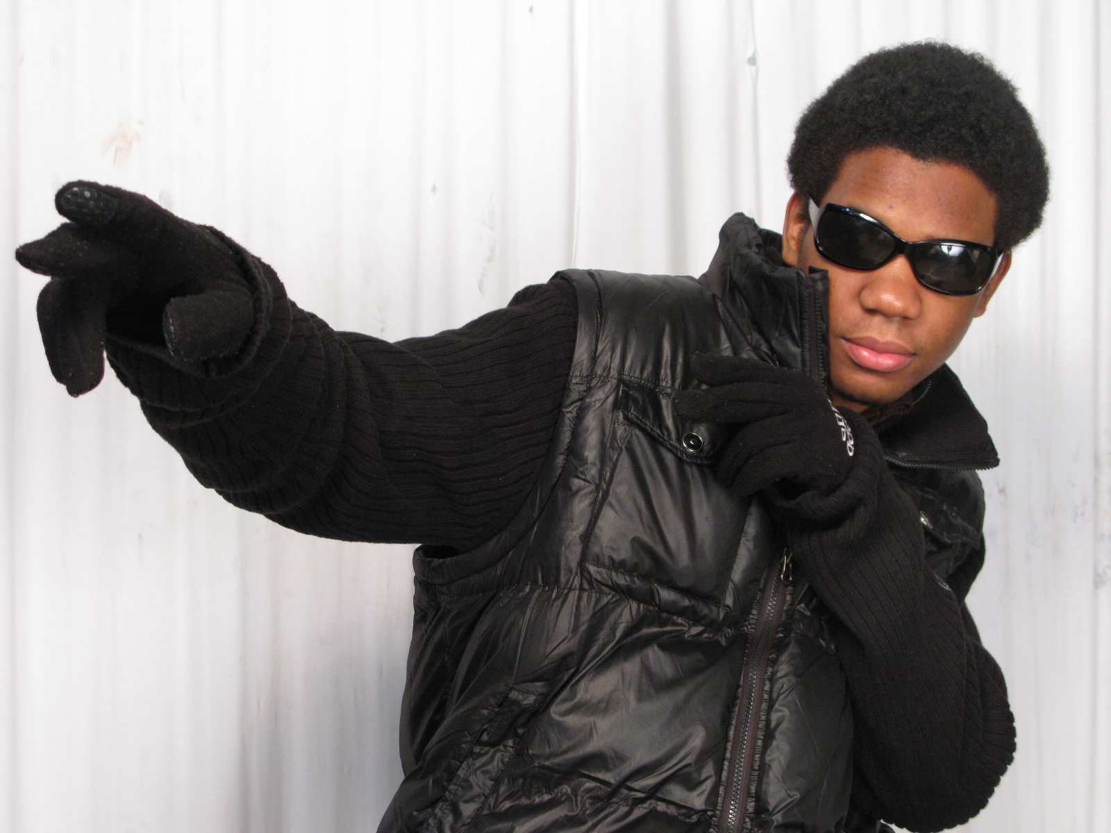

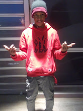
As shown these are the photographs I was able to take during my spare time up in the 02 and some in the Graphics department. Each one of these photos will benefit me when it comes to creating my magazine and I also have a choice in which ones I would want to use to display in my magazine. If you haven't noticed already each image has a different background, camera angle, mise en scene items such as clothing with diverse lighting to each one; it was key to make sure that shadow effects and contrast was shown in my images for it would definitely make the picture stand out so much more once imported into my magazine. Group photos would look good for parts of my magazine such as the contents page and long medium shots for the front cover and double page spread. I see these pictures as experimentation for I was clearly experimenting with what type of pictures I could produce and what would look better with the clothing including background.
Monday, 7 March 2011
Hip Hop Music Magazine - Sketched Layout Design

Displayed above is my sketched out plan of my music magazine front cover which I'll be looking to create on InDesign but if not the InDesign software then Photoshop CS3 which I'm a lot more comfertable with. As shown I'll have an image of myself in the middle with the text completly surrounding me and another piece of my own imagery on the left hand side of someone else posing as another artist. The rectangles around the image is where I'll be placing text however I will add text in other areas instead of just in the rectangle boxes.
Above the main image is where I'll have the Main header. Since this is the prototype version there are small faults to it but when I get the oppurtunity of making the music magazine it'll definitely look a lot better.
Moving on from the magazine layout displayed below I have the three main bullet points of what I unquestionablly need in my magazine:
- Powerful Colours such as Red and Black and possibly other colours that will make the magazine look attractive and eye catching; possibly gray and white.
- I'll need bold font in different sizes and styles and colours similar to the KING magazine but ranging a lot more from text.
- Without a doubt I need High Quality pictures that stand out a lot especially for my main image, so I need a good quality camera to take the pictures for I wouldn't want pictures pixelated and hard to recognise.
- Punch lines / slogans are important for my magazine for without these my magazine would be boring and not much to read up on especially if the reader isn't really feeling the vibe from the vocabularly being used.
- Graphical symbols in the background e.g. stars, crowns something to make the magazine look a lot more conveincing.
Hip Hop Music Magazine Front Cover - KING

I have taken a huge interest for this magazine; a lot of research was taken in to looking for this particular magazine for I had to search through the VIBE, XXL, TheSource mags. What catches my eye about this magazine is how Jay Z has been centered in the middle of this magazine for he is the center of attention and all eyes are on him, for the sub headings and small text are stacked and cramped around him. The camera shot of Jay Z would be a medium long shot which is a good camera shot for this magazine for you can see the clothing he is wearing along with the accessories he's also wearing such as: the chain and the watch. The fact that he's been gray scaled (black and white) suits flawlessly with the magazine. The colours are definitely powerful and up lifting, for his pose suggest the success that he has achieved and it looks as if he's looking down on the reader. The Main Header "KING" behind him explains it all, the fact that it's massively bold behind Jay Z and not in front of him illustrates that he is King and the main event of the magazine.
The text ranging from colours of yellow (stands out a lot more), white (in front of a black border background), gray, and black shows what stands out a lot more, and the sizes of them each shows this also.The Text in bold showing "DIDDY code of silence" could possibly mean a teaser music video exhibiting and discussed in the magazine. Main sub headings of Artist names and sub headings drawing males in "Sexy Pics" undoubtedly shows what type of audience the magazine is guaranteed to draw in. Overall the reason for choosing this magazine to support me in my own music magazine design is because it stands out so much more compared to other magazines which look exactly the same to each other which is the reason why I've switched up by collecting a magazine that uses a main picture in a slightly diverse way and text to center out the picture.
Hip Hop Music Magazine - Front Cover, Contents Page & Double Page Spread Examples

The Codes and Conventions of this Music Magazine are publicized and unproblematic to notice for they stand out so much, such as the colour for example: as shown they're bright pink, black and a gradient mixed background. All the font in the design are bold and stand out just as much as each other however the Header and the subheading stands out even more; VIBE" which is the title of the magazine and "Lil Wayne" the sub heading in a bold pink colour. The artist himself Lil Wayne is in a powerful mid shot pose, with an intimidating face expression on his face and not a chocolate box however this could have a positive effect on the audience because they know the artist is prosperous and has the attitude of a real hip hop artist.
The target audience for this magazine would definitely be males, of working class who like hip hop music with a passion and are probably looking for a music career, back to discussing the codes and conventions, the way text has been arranged around the artist really does give it a stand out effect and makes the magazine become the center of attention
Contents Page - VIBE

Contents Page - VIBE
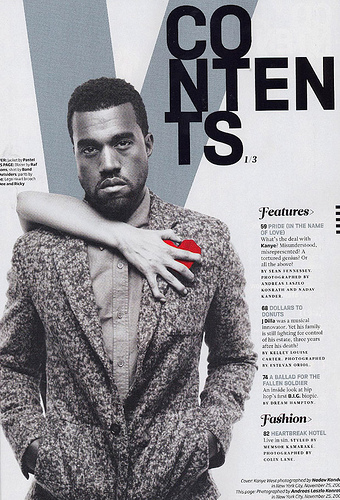
This Vibe contents page is very unique but simple, as shown not much detail is included within it but it's shown briefly, with a mid shot image of Kanye West at the front with a gray scale photo filter. With a large V at the back being the first letter of the title of the music magazine, also not to mention the text on the right side of Kanye west is miniature but it lets the reader know of the main articles, the regulars and what else is to be displayed within the magazine. Also shown the colours are dried out but it all blends in perfectly with each other. His face expression emotionless probably matching the mood of the contents page, however the contrast and colour is shown in the Poppy, this page may signify that he likely has a new song or album out and this is a teaser picture.
However I believe the main reason why VIBE has used Kanye for the contents page is for when the reader flicks the page from the front cover to see the contents page it draws the audience in a lot more for someone famous and populars face is shown. Returning back to his face expression it likely signifies that he's a laid back character and from his appearance there's something powerful about him for he has his pockets in his hands and the V behind may also show this.
Double Page Spread

This double page spread gives you an idea of what a hip hop double page spread looks similar to, which shows of Lupe Fiasco's interview at the time shown 9:30, displayed on the first page on the left hand side is a medium close up image of him and a banner or header revealing his name; not much is shown on this page because I've noticed from scoping out and completing some research that the image is usually on the left side and on the right side is the interview that was taken, displaying a quote from one of his songs, reasons for this may be because it's predictable and likely that the reader always looks to see what's shown on the right page which is why the image is there to reveal to them who the artist is, and once they've finished analysing the picture and the header they then want to know more about what the "Fiasco @ 9:30" represents which is why they read onto the interview on the left, this is a technique not only used by Hip Hop Magazines but a number of Music genre magazines.The colours are used seem pretty general but match perfectly with his cloth wear. As shown from the text on the right, some of the text is highlighted in yellow which probably show to the reader his answers to the questions being asked which is a technque I'll hopefully be able to use in my own double page spread.
Subscribe to:
Comments (Atom)