About Me

My photo
My name's Patrick and I am an A Level student,taking on AS Media Studies for a year. I am enjoying the subject and through this I hope to gain more knowledge of what type of affect media has worldwide

Tuesday 11 January 2011

New Topic - Music Magazines

Now that we have finished our school magazines we are now moving onto a new topic which is "Music magazines", we must choose a genre in which we are familiar or interested in for example: Hip Hop, Rock, Musical etc, remembering the codes and conventions and what type of target audience we'll be attracting.

Example of a Music Magazine - Jockey slut

  • In this magazine there is a minimal use of colour as shown you can only see the colours, black, yellow and white, the background colour is slightly plain also however you can see the light from the background is reflecting with his face. There are no other supporting images in the magazine just the simple image of the man in a large close up shot which could tell us half the magazine is about himself. 
  • The title is displayed behind the artist to simply show that the image of the man is the main feature on the front page or this ideas was probably used to create a graphical effect which is commonly used by several magazines.
  • Artist eyes are directly looking at the camera which suggest that he's looking at the audience to spread a message from the puzzeled looking expression on his face which is a chocolate box.
  • The text is completelty the same however it can be shown in different sizes and colours such as the words "The streets" which is in caps and is bold with white writing and is most likely the main sub-heading.
Target audience for this magazine would be:
Working class, white british males from the ages 20 - 30 years old.
Secondary audience would be the partners of the males, which are female women or secondary audience could be teenagers who are familiar with the artist on the front cover.

Genre
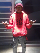
This looks like an urban magazine because of how the man is dressed with the cap, shirt annd jumper, it also seems to me like a magazine of club music such as drum & bass along with djing.

I still have yet to decide which music genre I'm doing that I'm familiar with and how I plan on making my magazine using the codes and conventions, along with what I have been taught by making my school magazine and how i can make my music magazine a lot better using the inDesign sofware. It'll definitely be a challenging task but I believe I'll be able to complete it without much problems. Athough this topic is a lot more easier because it's to do with music which is something everyone will be able to relate to.

School Magazine Powerpoint Delay !

(!) As some of you already know my USB was lost after a lesson which I forgot to collect when I left the classroom and had my School magazine powerpoint which explains the process of how I created my magazine, target audience, codes and conventions etc. However the good news is I now have a NEW usb which will be taken care of a lot better then my last. So there is a slight delay for I now have to redo my Powerpoint which was approximentally 15 slides so you can expect to see that soon. (!)

(!) Kelsey Park Sports College - Information & Technology Magazine

Displayed are my Kelsey park sports college magazine of Information and technology, and my contents page. These designs took awhile to create however I overcame the challenges and was able to deliver what is shown in this post. Now that you have viewed these designs I'll now explain how I created them and what problems I had when making them:

These designs were created on photoshop CS3 along with a small use of inDesign which I had problems with in the past but am now able to use the software to my full potential. The colour palette for this magazine was blue, black and yellow which I believe are slightly technical colours however very unique like colours which went well with the theme of my magazine. The pictures taken from my own photography also look perfect with my magazine because as you can see the main picture shows sixth form students on the computers doing their work smartly dressed, and the thumbnail like pictures display what's to be expected when you enter the department and what type of environment interested students will be working in during their participation on the course. when creating the effects I used photoshop however to crop and resize images along with the texts appearance which is blatant and would be the first thing that catches the readers eye because of the bright yellow along with the black stroke / yellow stroke I used inDesign. Alot of work was put into making this front cover for it took me a week and a couple days because of how my ideas continued to change to improve it and make it look better each time which was my experimentation.

The contents page was pretty simple for all I had o do was creating something basic but just as interesting as the front page however not to overwhelming for it would make the front cover look inferior to it. This page may also look familiar, this is because I used my example magazine contents page to help me with my own along with changing pictures, background colour however I really liked the layout of my contents page example so I used the layout with my own. Yet again as shown text is completely the same as the front cover for it is the contents page and there is a lot more writing going into more detail about what is yet to be revealed in the course. The colour palette has exactly the same colours however I have lessened it for I preferred a more basic like contents page with one student doing his work, this is where my ideas took over for as it looks as if the student is typing away the numbered bullet point descriptions of the course on the computer.


Overall the final magazine and contents page looks very intriguing to myself for I never thought it would turn out as good as shown. However there is still a lot more I can improve on in this magazine and this task has taught me a lot about the research, codes and conventions of a magazine and the target audience which the magazine must attract.

Feel free to write on my blog about the task on how I produced this magazine or the different challenges that I had to overcome when making it, you can also suggest on what I can improve on to make the magazine look  lot better for it would help me a lot when making others during the course of other task ?

Friday 7 January 2011

School Magazine Relation

 
The reason for this school magazine to be displayed onto my blog is because I was intrigued by it and it's appearance, the range of the colours and the text in which it ranges from many is something that is new to me and is an idea that I can easily pick up and use in my own School magazine. The way in which this person has designed this magazine, looks like an experimentation but one that has turned out successful, it's completely diverse from what I've seen from other school magazines and has several features that stand out a lot more then others:
  • The front cover is different from many I have seen as well as my research because there's a large medium close up of a student sorting out a video camera as a background like image with the gradiented yellow behind the image.
  • Then there's the four thumbnail images that display what you can expect when you go to High Hill media college ranging from partnership with a friend, working together and suitable environments to work in. The text also stands out from everything else which is the "Let's Animate!" text and the main colours which were used: Yellow, red and a tint of white and black.
The magazine isn't too complicated, or completely packed out, it's simple to understand and is a very convincing school magazine cover, along with the fact that it begins in the autumn term and the contents page displays what the college has in store. Without a doubt I'll be using this magazine to support my own ideas.

Thursday 6 January 2011

My Photos


These are the photos I took in the IT department which I would use for my school magazine, but also evidence of my photography, the angles in which most of these pictures are taken at are mid shots; the reason for this is because I needed a full picture of students working on computers in a hi tech department and for the audience to see the work displayed on the computer. Not only are there mid shots but a long shot of the department and a medium long shot of a flat screen television in the balchin centre. I'll definitely be using these pictures in my magazine because they're my own and relate to the information and technology .