About Me

My photo
My name's Patrick and I am an A Level student,taking on AS Media Studies for a year. I am enjoying the subject and through this I hope to gain more knowledge of what type of affect media has worldwide

Thursday 24 March 2011

Music Magazine - Feedback from Peers

After finishing my music magazines, contents page and double page spread I looked at them in more detail, seeing if I could improve them in anyway, however if I were the only judge of my final pieces then I wouldn't really be getting an overall overview and analyses of my pieces so what I decided to do was ask my peers for their feedback.

Jakub: - "I like his final pieces, he definitely has used a similar colour palette throughout all the final designs, and the pictures displayed within the designs are high quality and eye catching, I have to admit.. if I saw this magazine in store I would definitely take a glance through it and probably purchase."

Jacky: -  "For the front cover I like how he's created the layout and how the colours red and white match together perfectly even with the red top that stands out."

Robert: - "I like how you've organised the features in your final pieces, the graphic effects are really good, and how everything is in proportion with each other, especially the pictures in the contents page. Also I like how much your final front cover stands out from everything else, in a way it's kind of enlightening.

Muuadh: - "I thought this magazine was brilliant you followed the codes and conventions of music magazines and you produced a very good magazine cover along with a detailed contents page and convincing double page spread.

From the feedback that I was able to gain from my peers it really did help me for most of it was positive yet I believe it could've been improved in many ways such as my double page spread; the colour palette goes well with it however I believe it's slightly a bit too dark especially with the green text which is clashing with the black background a little too much, also the positioning of the paragraphs (interview) I could've organised a little better however I'm pleased with how all the designs turned out, along with the feedback that I was able to retrieve from my peers.

Thursday 17 March 2011

Hip Hop Music Magazine - Evaluation


In what ways does your media product use, develop or challenge forms and conventions of real media products?

Creating my hip hop media products was a huge challenge, using the forms and conventions of real media products came easy to me for looking at my examples I had a great idea on what I wanted my front, contents and double spread pages would look like, especially when it came to choosing what combinations of colours I was going to use for the covers. Also the media products from my products I gained knowledge on how the magazine should be laid out and what type of text should be used which was; bold, powerful and an increase on font size when it came to headers and certain sub headings.

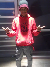
Developing my media product was challenging for I began experimenting with how I should make my media products look and what pictures of my own photography would go well in the magazine, as shown below in my blog there’s a number of different photos; most of the pictures shown were used however certain photos didn’t stand out as much as others, which is why I selected each photo carefully. The layout of my magazine was definitely something I had to build up on, developing towards it gradually however successfully as shown from my front cover, contents page and double page spread.  The colour was also an issue at first however the more I experimented the happier I became when it came to selecting the group of colours which would match perfectly together for as you can see from the front cover the photo of myself in the Feltics top is clearly red, so it was important that I made sure red was the primary colour that stood out the most from the rest which is what I believe I achieved.

I believe my media products do challenge real media products because it looks very convincing of being an official magazine, because of how features of the magazine have been organised and laid out. I’ve gained comments from my other peers and they believe if this were a real magazine they would purchase it because it stands out so much because of the colours and the pictures that have been selected including the layout.  Compared to most of the hip hop magazines I have seen apart from my research I think my magazine is up to standards of those magazines such as: XXL, the source and several other official magazines. 


How does your Media product represent particular social groups?

Particular social groups are represented in my magazine as people looking to make something of themselves and as you can see from the names and the pictures it looks more of like a teenage hip hop music magazine but with all the same aims as other real media products such as XXL and KING; to be of interest to the public and target audience who like reading these type of magazines and what is to be shown within the magazine by looking at the contents page.  As you can see by looking at the front cover and contents page the ethnic group shown within the magazine are black males with a different fashion sense and aims involving hip hop music. However the social groups all aim for one thing, which is to be the best and to make something of themselves which includes music along with becoming famous and wealthy, also from looking at this magazine, it can be seen as a mainstream magazine which the artists are looking to reach, for this magazine doesn’t just range nationally but it aimed worldwide around the world especially in America.


What kind of Media institutions might distribute your media product and why?

Media Institutions with a financial plan that doesn’t really go all out with the prices of advertising and producing several copies of my genre of magazines are likely to distribute my media product; the reason for this is because the fact that my magazine is a hip hop magazine and there are several other similar magazines out in the market with a similar genre means competition is high and the fact that popular hip hop magazines such as: XXL, the Source, and Scratch are currently at the top currently , it’d definitely be difficult for my magazine to reach that standard, although the front covers and contents page etc are very eye catching it’s likely that my magazine could reach the top quiet easily as long as production  of the magazine is monthly and each magazine cover becomes a lot more intriguing then the last. However currently there are many other magazines in the same position similar to my own struggling to reach the top along side the popular magazines which have to keep their reputation up by releasing better magazines every month. Although my magazine is something different to teenagers are seen at the front of my magazine it could be a new type of hip hop magazine for I haven’t seen any official magazines in the market with teenagers displayed making big impacts with music.


Who would be the audience for your media product?

The audience for my magazine would definitely be young male teenagers and females who still attend school and have an interest for music and talent from their own age range for it could inspire them to become involved and be featured in the magazine by making the same affect that artist on the magazine have. I’ve created a double page spread which is an interview with me (P4TRICK) on what’s to be expected from my career, how things are going and what’s to look out for. Which is something the teenage audience without a doubt will look forward to because if they want to make something of themselves with hip hop music then reading on an interview will help them on how to get started and lead them the right way. Another (secondary) target audience of my magazine could possibly be older males and females of working class with some engagement with the music industry also because it’s possible they’d want to know how the next generation of artists are coming along and what type of songs they’ve been releasing and it’s likely hip hop artist could sign young teenagers depending on how good they are, an example of artists that started of from younger years would be Lil Bow Wow and Chris Brown who made a career from music by creating songs from when they were young. 


How did you attract your Target audience?

I attracted my target audience by making sure my front cover stood out the most from everything else, especially the image itself, which is in high definition quality, I had to make sure in the photo the person was looking at the reader so they’d be drawn in by it and the whole design overall and by the colours for as you already know red is a very powerful colour, the main reason why I chose red was because the picture mid shot image of the person in the middle was wearing red made the entire magazine look swaggered out (colour co-ordinated) which is the term used by young teenagers now  and is another reason why young teenagers are my target audience. The punch lines in my front cover, such as the sub headings; an example of this “DEE Feels Reborn” which is a sub heading I was able to think of quiet easily and definitely make the target audience curious on what kind of impact DEE will have due to him returning.  Shown on the front cover you can see that a free young money calendar lies within the magazine for the reader which is something that will come in handy for the audience, another technique I used but to attract the male audience is the “Nicki Minaj Photo shoot – Teaser Pics”. The design overall I believe is very eye catching and without a doubt people would set their eyes on it and are likely to observe the front cover to observe it and to look at the contents page to see what else is in store within the magazine.


What have you learnt about technologies from the process of constructing this Product?

Well from the software I have used which are Photoshop and Indesign, I felt a lot more comfortable creating the media products on Photoshop because it really does make a difference and there a number of different features you can do on Photoshop CS3 that you can’t perform on Indesign which was disappointing. However my skills have definitely developed from using the software and by using a small bit of Indesign I have learnt how to construct a magazine better and to make a simple design turn out to better then a completely edited design.  Both software’s are just as good as each other but I’m a lot more familiar with Photoshop and the fact that of the features that you’re able to complete on it that Indesign doesn’t have. Also from my research I have learnt how to make my media product look more like a hip hop music magazine by looking at the different text, how images are positioned and how layouts for the magazines are constructed together and the typical language used in a hip hop magazine to attract the audience.


Looking back at my Preliminary Task, what do I feel I have learnt in the progression from it to the full product?

From my preliminary task I believe I have improved a lot more and have learnt a huge amount about the codes and conventions that need to be used within a magazine to make it stand out just as much or maybe even more as real media products. As shown below you I have my Kelsey park sports college information & technology magazines. I can clearly see the improvement from these to my music magazines, for I now know  how to choose the colours more wisely and make certain images stand out and using the right camera angles such as mid shots and close ups, also text used and sub headings are important and this is also something that I have progressed on.  From looking at my school magazines it looks like the front cover is like a contents page but now looking at my music magazine front cover it looks a lot like a real media magazine cover: with sub headings, a title that stands out and a simple design with not to many effects but has the same impact as many other music magazines. 


Comparing the contents pages you can see the school contents page was plain and didn’t really have much going on but when comparing it with my hip hop contents page I have so much going on and without a doubt has the contents look especially when comparing it with my examples you can see that it belongs, the layouts are completely diverse from each other because in the school contents page all you have is the plain white text, the image of the student working on the computers a gradient black and blue background and the header, and sub heading at the top which pretty much shows not much was done to it, however  compared to my music magazine contents page a lot more has been done and I’ve been able to develop it so much more then the preliminary task which I’m pleased with, as you can see; you have a new style layout which I was able to learn from my research and use it within my own school contents page along with my front cover and images that I took in Trocadero that look high quality and didn’t need any cropping for the pictures themselves already displayed everything I needed.   

For my Hip hop music magazine front cover the header stands out so much more then the Kelsey Park front cover header due to the fact that it’s double the size of it and is boldly red. Along with a colour palette that really brings out the picture and the text. The images are a lot more different as shown the music magazine has high quality like pictures however in the school magazine I’ve edited the picture increasing the contrast in them and giving them a blue highlight which I hoped went well with the magazine which I believe it did however I think I could’ve taken much better pictures which would’ve looked a lot better with the magazine itself. On the other hand comparing the two front covers you can see the areas where I have improved and how I’ve been able to apply the codes and conventions of other real media magazines into my own which really helped me.


The double page spread for my music magazine was a new approach, and consisted of an interview where a student with a questionnaire had to ask me a number of questions on the career of being a rap artists and how I grew into becoming one of the top hip hop artist from a teen age. The colours used look dissimilar from the rest of my music magazine because I wanted it to look unique and become the main event which the target audience would look forward to inside my music magazine. However it does go well with my music magazine and is something that I was new to since it was the first time creating a double page spread from scratch but of course I had to do some research on how to make it look: where the main image has to be placed, where quotes were to be positioned and what type of questions and answers that needed to be displayed in the double page spread.


Wednesday 9 March 2011

Hip Hop Music Magazine - Final Double Page Spread

Music Magazine - Double Page Spread Layout

The double page spread was a lot more challenging, which is why I started of by creating this layout to help me when placing images and text into the final version. However the entire design will be completely edited from what's shown here for as you already know this is a prototype version. Although the colour palette ranges because I don't want to be repeating myself by using the same colours of red, black, gray and white but something completely different such as a green and white, but I'll be experimenting to see what I prefer best. This means changing the lighting on the pictures and making certain text stand out with diverse fonts. As shown:
  • The Red rectangle strokes are for images
  • The Black rectangle strokes of different sizes are where text will be placed

Hip Hop Music Magazine - Final Contents Page

Hip Hop Music Magazine - Final Front Cover

Tuesday 8 March 2011

PacJerkers 2011 NJA International Poster Video

Hip Hop Music Magazine - Powerpoint Development

Slide 1 - Music Magazines
Slide 2 - Genre: Hip Hop

Slide 3 - The Research
Slide 4 - The Codes & Conventions: The Source
Slide 5 - Fonts: VIBE, SCRATCH, THE SOURCE
Slide 6 - Hip Hop Target Audience
Slide 7 - Conclusion
Displayed above is seven slides that explain: my genre, the codes and conventions of example magazines which were researched, the font which is regularly used in a hip hop music magazine ranging from a number of different colours, the target audience of this genre and reason behind them being attracted to hip hop magazines and a conclusion which explains: how my research will help with my magazine, my primary target audience and an brief overall explanation of how I will have to apply research and planning to my own music magazine overcoming the challenges that lie ahead.

Music Magazine - Photography


As shown these are the photographs I was able to take during my spare time up in the 02 and some in the Graphics department. Each one of these photos will benefit me when it comes to creating my magazine and I also have a choice in which ones I would want to use to display in my magazine. If you haven't noticed already each image has a different background, camera angle, mise en scene items such as clothing with diverse lighting to each one; it was key to make sure that shadow effects and contrast was shown in my images for it would definitely make the picture stand out so much more once imported into my magazine. Group photos would look good for parts of my magazine such as the contents page and long medium shots for the front cover and double page spread. I see these pictures as experimentation for I was clearly experimenting with what type of pictures I could produce and what would look better with the clothing including background.


Monday 7 March 2011

Hip Hop Music Magazine - Sketched Layout Design

Displayed above is my sketched out plan of my music magazine front cover which I'll be looking to create on InDesign but if not the InDesign software then Photoshop CS3 which I'm a lot more comfertable with. As shown I'll have an image of myself in the middle with the text completly surrounding me and another piece of my own imagery on the left hand side of someone else posing as another artist. The rectangles around the image is where I'll be placing text however I will add text in other areas instead of just in the rectangle boxes.
Above the main image is where I'll have the Main header. Since this is the prototype version there are small faults to it but when I get the oppurtunity of making the music magazine it'll definitely look a lot better. 

Moving on from the magazine layout displayed below I have the three main bullet points of what I unquestionablly need in my magazine:
  1. Powerful Colours such as Red and Black and possibly other colours that will make the magazine look attractive and eye catching; possibly gray and white.
  2. I'll need bold font in different sizes and styles and colours similar to the KING magazine but ranging a lot more from text. 
  3. Without a doubt I need High Quality pictures that stand out a lot especially for my main image, so I need a good quality camera to take the pictures for I wouldn't want pictures pixelated and hard to recognise.
Alternative Ideas
  1. Punch lines / slogans are important for my magazine for without these my magazine would be boring and not much to read up on especially if the reader isn't really feeling the vibe from the vocabularly being used.
  2. Graphical symbols in the background e.g. stars, crowns something to make the magazine look a lot more conveincing.

Hip Hop Music Magazine Front Cover - KING

I have taken a huge interest for this magazine; a lot of research was taken in to looking for this particular magazine for I had to search through the VIBE, XXL, TheSource mags. What catches my eye about this magazine is how Jay Z has been centered in the middle of this magazine for he is the center of attention and all eyes are on him, for the sub headings and small text are stacked and cramped around him. The camera shot of Jay Z would be a medium long shot which is a good camera shot for this  magazine for you can see the clothing he is wearing along with the accessories he's also wearing such as: the chain and the watch. The fact that he's been gray scaled (black and white) suits flawlessly with the magazine. The colours are definitely powerful and up lifting, for his pose suggest the success that he has achieved and it looks as if he's looking down on the reader. The Main Header "KING" behind him explains it all, the fact that it's massively bold behind Jay Z and not in front of him illustrates that he is King and the main event of the magazine. 

The text ranging from colours of yellow (stands out a lot more), white (in front of a black border background), gray, and black shows what stands out a lot more, and the sizes of them each shows this also.The Text in bold showing "DIDDY code of silence" could possibly mean a teaser music video exhibiting and discussed in the magazine. Main sub headings of Artist names and sub headings drawing males in "Sexy Pics" undoubtedly shows what type of audience the magazine is guaranteed to draw in. Overall the reason for choosing this magazine to support me in my own music magazine design is because it stands out so much more compared to other magazines which look exactly the same to each other which is the reason why I've switched up by collecting a magazine that uses a main picture in a slightly diverse way and text to center out the picture.

Hip Hop Music Magazine - Front Cover, Contents Page & Double Page Spread Examples

Hip Hop Music Magazine: VIBE
The Codes and Conventions of this Music Magazine are publicized and unproblematic to notice for they stand out so much, such as the colour for example: as shown they're bright pink, black and a gradient mixed background. All the font in the design are bold and stand out just as much as each other however the Header and the subheading stands out even more; VIBE" which is the title of the magazine and "Lil Wayne" the sub heading in a bold pink colour. The artist himself Lil Wayne is in a powerful mid shot pose, with an intimidating face expression on his face and not a chocolate box however this could have a positive effect on the audience because they know the artist is prosperous and has the attitude of a real hip hop artist.

The target audience for this magazine would definitely be males, of working class who like hip hop music with a passion and are probably looking for a music career, back to discussing the codes and conventions, the way text has been arranged around the artist really does give it a stand out effect and makes the magazine become the center of attention

Contents Page - VIBE
This Vibe contents page  is very unique but simple, as shown not much detail is included within it but it's shown briefly, with a mid shot image of Kanye West at the front with a gray scale photo filter. With a large V at the back being the first letter of the title of the music magazine, also not to mention the text on the right side of Kanye west is miniature but it lets the reader know of the main articles, the regulars and what else is to be displayed within the magazine. Also shown the colours are dried out but it all blends in perfectly with each other. His face expression emotionless probably matching the mood of the contents page, however the contrast and colour is shown in the Poppy, this page may signify that he likely has a new song or album out and this is a teaser picture. 


However I believe the main reason why VIBE has used Kanye for the contents page is for when the reader flicks the page from the front cover to see the contents page it draws the audience in a lot more for someone famous and populars face is shown. Returning back to his face expression it likely signifies that he's a laid back character and from his appearance there's something powerful about him for he has his pockets in his hands and the V behind may also show this. 

Double Page Spread

This double page spread gives you an idea of what a hip hop double page spread looks similar to, which shows of Lupe Fiasco's interview at the time shown 9:30, displayed on the first page on the left hand side is a medium close up image of him and a banner or header revealing his name; not much is shown on this page because I've noticed from scoping out and completing some research that the image is usually on the left side and on the right side is the interview that was taken, displaying a quote from one of his songs, reasons for this may be because it's predictable and likely that the reader always looks to see what's shown on the right page which is why the image is there to reveal to them who the artist is, and once they've finished analysing the picture and the header they then want to know more about what the "Fiasco @ 9:30" represents which is why they read onto the interview on the left, this is a technique not only used by Hip Hop Magazines but a number of Music genre magazines.The colours are used seem pretty general but match perfectly with his cloth wear. As shown from the text on the right, some of the text is highlighted in yellow which probably show to the reader his answers to the questions being asked which is a technque I'll hopefully be able to use in my own double page spread.

Thursday 3 March 2011

#6 Representing the Genre - My Ideas, Signifiers & Contents Page

Representing the Genre should be straight forward because of it being such a popular type of music and the fact that a range of magazines have been created with different ideas shown in my research with diverse: colours, themes, pictures and font styles, makes it a lot easier for me for I'll be able to gather up a number of ideas. Vibe has to be the Hip Hop magazine I have taken much interest to for the font used stands out just as much I would want my own to, and the pictures used along with the colour palette used is just perfect to support me when making my own Hip Hop magazine. http://www.vibe.com/

Front Cover Ideas
The ideas I have briefly schemed up for my own Hip Hop magazine would be similar to Vibe & XXL Magazines, the header would need to be bold and a rich like colour that out shines the rest of the text, along with it being on the top of the page. I've decided to use powerfully immense colours such as: red, black, gray and white which are suitable colours to make a magazine stand out, this also means that the image which will be of my own photography collection to take a picture of myself or someone in the right clothing to match the theme of the magazine itself in a rapper's pose with probably a gesture that gives the reader a sign, also the camera shot without a doubt has to be a mid shot. The sub-heading and the rest of the text has to stand out just as much on both sides of the image; the likely colours I would use are red and black for the text or even white with a red rectangle shapes background for each one of the text's area. As I previously said I have a several ideas that will be relevant for my Hip Hop Music Magazine but it's just choosing the right one that will be suitable and me being pleased with.

Contents Page Ideas
My contents page will look a lot similar to my front cover however a lot more detail on what's to displayed within the magazine and what other artist are to be featured in the magazine. This also includes: The Main Features (Front Cover artist information and Double Page Spread Interview information) , Minor articles (Other Artist and their current statuses within the Music Industry) and the Regulars (Fashion reviews, The Charts and recent music releases) Nevertheless the contents page will have a lot of unfamiliar features from the contents page but they will still look related to each other; using the same colours but a whole completely new theme from one another since the contents page consist of a lot more detail and pictures from different angles.

#5 My Target Audience ?

My primary target audience due to my genre which is Hip Hop would be:
  • Gender: Young Males and Older Males 
  • Age: 16 - 40 
  • Social Background: Working Class, Middle Class, Still in Education, Males looking to make it into the Hip Hop industry
Secondary Audience
  • Gender: Teenage females
  •  Age: 16 - 25 
  • Social Background: Middle Class, Education, Teenage Mothers
To attract my target audience my header needs to be something inspirational which they can look to as a sign of hope or something that will keep them interested in the magazine, a header that shows that the magazine is Hip Hop but something that gives everybody an oppurtunity in entering the Hip Hop industry, or from the information on the front of the magazine, headers that really catch their attention.

#4 Music magazine & it's Genre Including the Attraction of Target audience

The music magazine blaitently signifies it's Genre for example Hip hop because it's displaying the Hip hop artist at the front of the magazine (Eminem) along with text that matches the entire theme of the Hip hop magazine, also reading the text for example "Vengeance is Eminem" reveals to us that Eminem the hip hop artist is back to get revenge in the Hip Hop world, meaning he's currently or even released songs that explain his "Vengeance". Also on the top left it has "Hip Hop on a higher level" which evidentely shows that this is a hip hop magazine.

The fact that the magazine is popular and many people know of it's existence, it has a worldwide known hip hop artist at the front in a mid shot position with a gun in his right hand, a skull on his chest and devious looking eyes, with a gradient black background and transparent text highlighting the first and last letter of his name in a red stroke, is definitely saying something. The targert audience would unquestionably be drawn in by this front cover of the magazine for eminem is likely to be their favourite artist and the reader being shown how good the front cover looks gives them a sense of urgency to know what's in the rest of the magazine about a range of other artists and to know more about the "vengeance" of Eminem .

#3 Main Codes & Conventions of Music magazines

The Main codes and conventions of music magazines based on my research would be:
  • The colour which is a key feature of a music magazine for it gives the magazine that extra spark, along with it matching the clothing of the artist(s) in front of the cover. Also the colour always has a purpose, so a different theme is given to the magazine to make it distinctive to other music magazines released. 
  • The artist(s) who is in front of the entire cover and is the first part of the magazine to be set eyes on, so they make a huge impact to the music magazine, also depending on who the artist is judges on if the buyer will purchase the magazine, for example for a Hip Hop magazine an unknown artist or not so preferred artist is shown on front of the cover the buyer is likely to ignore it, however if it were a well known artist such as: Eminem, Lil Wayne or Wiz Khalifa the buyer is guaranteed to make a purchase.  It also depends in what type of position the artist(s) is in ranging from long shots, or extreme close ups however the camera shot which is most recognised and ideal would be the mid shot; a picture of the artist from waist to head.
  • Font is another important feature of a magazine, basic font such as Arial or Times New Roman are least exciting fonts and doesn't really show the uniqueness of the magazine and its presentation so it's best that the text is graphical looking with a lot to show. Size is another importance, main headers should have larger fonts and small topics should have minor fonts but that doesn't mean they should be tedious compared to the rest of the magazine.
  • The background must look appealing for it is the starting point of the magazine, without the background the music magazine would look dull and not as exciting and would be seen as average by many. Which is why it's best to have a nice design as the background matching perfectly with the entire magazine.

#2 Information needed within Research

Information is an important source for my music magazine for without it I'd be limited in the ideas, but the information needed within my research is based around the codes and conventions I definitely need an eye catching example music magazine, what I need  to be looking out for in the magazines; does the font match the rest of the magazine and does it stand out just as much as the picture, is the colour palette for the magazine unique, do the colours have a purpose of being used, banners and pictures need to have a massive affect. 


I believe the picture is the main idea of the entire magazine for it needs to look high quality and the mise en scene of which will be clothing needs to be likely bright colours or accessories need to be noticeable. Also I need to observe the magazines layout and how different pieces of the magazine have been arranged which make it good quality.

1# First Thoughts in Response to the Task

My first thoughts to the task; I was immediantly intrigued but at the same time thrilled to begin, for I do enjoy music and the fact that it has made a huge impact in my life such as a change of views and knowledge for particular subjects that are mentioned in different song's lyrics. The fact that I have been given the task to create a Music Magazine on the Indesign software means improving my ability and learning a number of different techniques. On the whole, creating a music magazine will definitely be a challenge for there will be several ideas that I can apply to my own magazine when thinking of the codes and convetions that can be applied, however I am looking to base it around the Hip Hop, R&B area of music but it should be good.